Sunday, July 24, 2011

Fun Rough Animation

I recently found Yoni Goodman's blog, Dailymation and boy did I like it. Pretty often he posts new rough scenes he animates. They usually last about 5-12 secs and take him 1-3 hours to create. Sounds like a good idea I says to myself.

So, after not animating anything for a long time, or drawing much for that matter, I decided to try my hand at a scene. It took me about 2 hours, and it turned out much better than I thought it was when I was timing it out. (My process of timing scenes is a very awkward. Any thoughts on timing scenes would be much appreciated) Overall it's just nice to get back to animating, if I go too long without doing any animation then I feel like a slob-kabob, if you know what I mean.

Here it is, tell me what you think.

Daily 1 - Happy Bounce from Tyler Williams on Vimeo.

Tuesday, July 19, 2011

Devolution

Well, I have finally had a little bit of time to draw since I've been out of the pen, hehe. All of these are from a Star, celebrity news magazine. Of course it's beach season, so everyone is mostly in bikinis and swimsuits. I mostly wanted to do a fold study on suits, because I watched this sweet animation called "Feelings from Mountain and Water" from the Shanghai Animation Film Studio and directed by Te Wei in 1988. It has some very expressive brushwork, but alas my religious reading of Star magazine only showed me a handful of suits and nothing but flesh and skimpy clothing, oh well.

Anyways, here are my devolutions, where I do a slow and steady realistic rendering, and slowly distort and caricature drawing by drawing.


Here is Selena Gomez


Here is Julianne Hough, not really sure who she is


Here are a couple of the sweet suit studies that I was talking about, dang doesn't this show, Torchwood, look awesome

Sunday, July 10, 2011

Jailbird

Well, these last 2 1/2 weeks were supposed to be my fun vacation, where I went to Michigan for the Electric Forest music festival and then to New York for Camp Bisco music festival, and then to Vermont and New Hampshire to visit friends, but it didn't happen like that. We only made it one state east, to North Dakota, when our car broke down. Then the police searched our car and we ended up staying two nights in jail in Cass County Jail, in Fargo, ND.

Lots of crazy things happened, and our car broke down three times altogether, so the vacation turned out to be an expensive failure. Braking down in North Dakota is the worst place to brake down in the world, it's flat, humid, ugly, lots of sketchy people, and not much for fun things to do. Anyway, I did some drawings while I was behind bars, so I thought I would post them. Not that they are that good, but I'm going to post them for the MEMORIES!


This first one is a fun layout for Bugs Bunny jumping around


I made this little comic strip once I knew I was going to be free, but I still had a couple of hours before I got released.


The top part says Moby-Dick, because that was the book that I was reading in Jail, only got through the first hundred pages. On the bottom is my recreation of and old T. S. Sullivant picture I saw.


And finally here is a sketch of the jail area, with the cells on the left and the tables in the middle. Man this one brings back memories.

Monday, June 13, 2011

Breaking Down Timing in Animation

Copied frames on top, made up poses on the bottom


Lately I have been drawing some UPA stuff so last night I tried to animate this simple bounce of some guy squashing down and stretching up, and I had a heck of a time with it. Should have been a very simple thing, but took me about 5 hours to do, I will post that later, it's not quite cleaned up yet.

So last night I also did some quick sketches on the arm and lever animation, and today I decided to animate one, it turned out pretty good. I then decided to break down the whole two second loop, just to see how they timed it. I feel like I read about this stuff, but it never really sinks in til I break it down.

The coolest thing that I noticed was when their was smooth action, say from side to side, it wasn't ever a perfect ease in and out. If the animator sprung into a pose, he would ease out slowly, or if he really eased into a pose, he would quickly move to the next one. I feel like this gives the animation a lot of variation, and I guess I have never noticed it until now.

Ultimately, I feel that I just need to do more animation, because I don't feel like I have much of a clue when I try and do it. Even when I try to time out a little scene to see how long everything will take, I still have to keep reworking it and reworking it. Then in the back of my head I keep thinking, how could all of the old masters learn to animate before pencil tests, I'm struggling with instant playback. Anyway, I guess it is safe to say that I am no master of animation.

Lever From - It's Everybody's Business (1956) from Tyler Williams on Vimeo.


Here is that bounce that I was talking about. You can see two of the positions are on the bottom right of the paper at the top. Don't know what UPA short this is from, but they were named Arcadian off of the Cartoon Modern blog, so that is what I am guessing the name is.

UPA Bounce from Tyler Williams on Vimeo.


As you can see, I didn't turn out at all, but it took me so much reworking already that I will let this one be.

Saturday, May 28, 2011

Shuffling Off To Buffalo Fun

Well, I long time ago I came across the sheet music with the directors notes from the 1930's Harmen-Ising cartoon, "Shuffle Off To Buffalo". This is a wonderful piece of history that Stephen Worth put up at the Animation Archive. Finally I did something useful with it. I broke it down and figured out how it worked, then I decided to do a scene for myself. The first one that I did was pretty long, and I used a different layout, a different character, and I didn't quite follow all of the directors notes. Overall, I don't think it would have passed inspection in a studio, but it was fun. I will have to post that later.

On my second go at it, I decided to copying the background exactly, and animate the character that was actually supposed to be animated. I just changed him a little bit. The scene is a lot shorter, but that made it easier to focus on and there was only action going on which made it more fun. This exercise really seems to work well because the only thing that I have to worry about is animating. Everything else, from the character design, to the background to the music and timing is already done for me. So here it is.

Shuffle Off To Buffalo Scene 5 from Tyler Williams on Vimeo.


I put the clip of the actual video at the end, it turned out pretty different, and definitely not as good. The three keys that I used from the original are these three pictures.


Also I just got Toon Boom a little bit ago which is were I animated this. I also inked a beautiful drawing from one of Walt Kelly's early Pogo Books.

Thursday, May 19, 2011

Angry Nazi Run

Here is a run cycle that John K posted from a Snafu cartoon. I thought it was pretty cool myself, so I decided to pencil test it. As far as animating goes, I really didn't do any. I just got the first key drawn right (or close to right) and then went image by image of the 12 frame cycle.

There are 6 frames a step on ones, and I just went back and forth between the frame I had just drawn and the next one to see what all moved, how much, and where.

Even though I didn't really animate on this one, it was fun to see how much and how little everything changed from frame to frame. I think it turned out good, one of my most fun to show people. I sat down and belted this out in only 5 hours, don't think that was very though.

Snafu - Angry Nazi Run Cycle from Tyler Williams on Vimeo.


John K Stuff: Real Animation
Original Post by John K

Saturday, April 30, 2011

Dancing to the Bosko Beat

Wow, I meant to post this thing like two or three months ago, but I guess I got busy and forgot. I had it posted on my vimeo channel, but I never got around to blogging about it.

This thing, would be the first lesson on animation from the John K Stuff blog. He talks about animating a simple character on musical beats as the fastest way to learn how to animate. So he then shows a clip of Bosko, from the 30's and it's simple enough to figure out. I went a little further, and got a couple more seconds of footage animated. This was also my first and only attempt at traditional animation with pencil and paper on my homemade light table (actually it turned out really good for only $15).

Bosko Dance Animation from Tyler Williams on Vimeo.


Now tell me what you think, hopefully I can get back to doing this more, it's sweet to flip through the animation and see it move before my eyes. Some nostalgic feeling that computer programs have never giving me, it just feels more real.

Here is the original post
John K Stuff: Animation Course Level 1, Lesson 1 - The Beat - Kali Does Bosko

Tuesday, April 26, 2011

NFB Animation Chart

Well it's been months since I posted anything, and the main reason for that is lack of time. With work, school, and snowboarding I barely had time for anything else, but alas snowboarding on chair lifts is over, and finals are next week, so I am going to be overloaded with spare time, which will be nice.

Speaking of spare time, I was browsing my usual blogs and websites one day a couple weeks ago, and I came across a great piece of animation history on Michael Sporn's Splog and it was the NFB Animation Chart from 1967. The original post is here and man does this have a lot of new info to me. It also has lots of in depth info on animators and directors. It's fun to see how much the directors and animators jumped from studio to studio.

Anyway, I was feeling frisky one day, and decided the pieced together scan that Michael Sporn so graciously put on his website wasn't perfect enough for me. I had printed it out on 16 pieces of computer paper, and glued it on to foam core, but it wasn't good enough. So I decided to recreate the entire thing from scratch in Adobe Illustrator, so that I could have a crystal clear recreation. Now about 20 hrs later it is finished, at 300 dpi and about 48 in X 36 in. Sorry for anyone who speaks French, but I only copied the English parts.

Now I can print it out on nice paper and frame it for my wall. I was thinking ePingo.com had decent prices for a print this big, but any suggestions would be appreciated.

Without further adieu, her is the poster in all it's digitally remastered glory!

(Actually this is just a preview because blogger will only let me upload an 8 GB image with a maximum resolution of 1600 pixels)

So I uploaded the image to Rapidshare, it is available as a full dimension and 300 dpi jpeg (15.4 MB) and also as a pdf file (0.2 MB), which is the file format I am going to have it printed from. Enjoy, and hopefully someone gets something out of this as well.

Links UPDATED 09/12

Wednesday, February 2, 2011

Quick Animation Studies

To get the feel for animation, I have been doing some quick studies by just going through the frames on a paused tv. The sketches are just rough and quickly sketched out so that I could see how the animation flowed. The first two are from Disney's Mickey Mouse In Living Color. The last one is from Looney Tunes Golden Collection Volume 5. It was fun being able to see a sort of movement as I flipped through the pages.

This first one is from the opening scene of The Nifty Nineties (1941)

Mickey Mouse Animation Check from Tyler Williams on Vimeo.


Pretty rough, but you can definitely see the action.


This second one is a lot faster action and a lot more fun to do, every frame seemed unique. It is from Plutopia (1951)

Disney Cat Animation Check from Tyler Williams on Vimeo.


I think this one turned out better


The last one is from Gold Diggers Of '49 (1935). It's of Beans, and he is a lot easier to draw over and over again.

Beans Animation Check from Tyler Williams on Vimeo.


Came out ok, but rough. I think that I need to make me a light table.

Tuesday, January 25, 2011

Eldon Dedini


Just got a new book a little bit ago, called "An orgy of Playboy's Eldon Dedini"

Now I can't paint at all, but I have been playing around with his sleek and plump women style. And I just did the whole picture to get a feel for his light and shadow, and how he composes his pictures. I will have to try my own sometime.

Here is the book on Amazon

Thursday, January 20, 2011

Bugs Bunny Covers

I decided to do some Bugs Bunny covers, then scan them in so I could see how I was progressing. Most of the time now when I draw I'm not at my house, so I can't scan in my drawings to check how close they are, or I'm drawing them off of movies I'm watching, so I don't have the original picture handy. So, for these covers I made sure to scan them in and critique myself.

(When I say his right foot, I mean his right foot, not the foot on the viewers right)


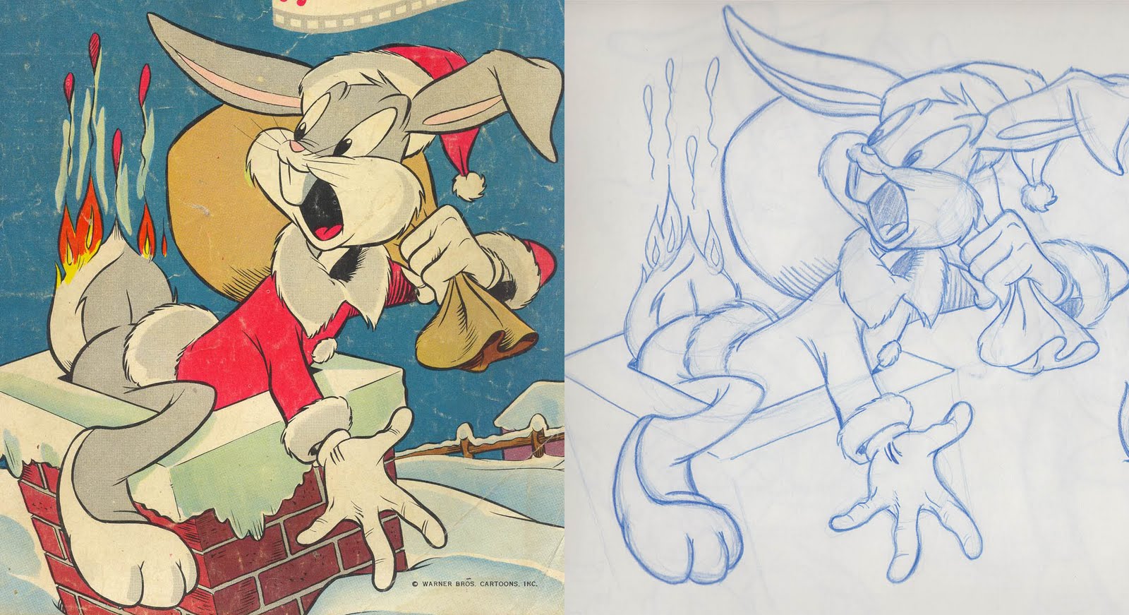
Here's the first one that I did, and it was the closest to the original.
- Everything on the head was consistently just a bit too small for the body
- Elbow too high
- Tail too fat
- Body, butt, hanging hand, and kicking leg and foot were a good size, just needs to be moved right
- Standing foot needs to be a little higher
Not too bad for that one.


The second one wasn't too bad,
- The entire head needs to be up and right
- His lower belly needs to be up, as does his left leg
- His left hand needs to be farther left
- His belt is too angled, it needs to be flattened out
- His right foot needs to be bigger
- His left foot needs to be smaller and at a different angle


Here's my third one, and I could tell it was getting late
- The LOA is too deep a u-curve, which makes him too short. His body needs to be taller and not as forward
- Both legs and feet too big
- Tail big and rotated wrong
- Face needs to be skinnier, and the hat needs to be taller
- Both hands need to lower
That one didn't look very good


Tried it again it looks a lot better than the last one, but I'm having trouble figuring out the basic shapes
- Head is too low, also needs to rotated clockwise a bit
- Tail needs to be bigger
- Right foot needs to be tilted up more
- Right hand needs to be smaller, and tilted down more
- Left hand WAY to big
Overall a much better drawing then the last one, but it was still hard to get the basic proportions down right.


The next one is of Elmer, and it was a lot faster, not so slow and careful
- His lower foot is too small, needs to be bigger
- Hat needs to be bigger
But it still turned out pretty good


This one came out pretty close, but I think it is very appealing, I also love the expression on his face, crazy but suave
- Both of his ears look too big
- Carrot needs to be bigger, bu the hand holding it needs to be lower
­ Other hand could be up higher, as well as both feet
- The mostly hidden foot's shape is off, needs to be more bulbous
All in all I liked how this one came out


This next one could have came out closer, just made him to fat and his head is tilted wrong
- His head needs to be tilted back more, which would pull the nose and cheek up higher. I could tell his mouth wasn't open enough when I was drawing it, but I couldn't tell what was wrong
- Neck collar needs to be bigger
- Outstretched arm needs to be lower
- Bugs looks too fat, needs a trim in his back
- Tail to big
- Leg big and needs to be back farther
Don't feel like I nailed this one


So I re-did it. Much Better
- Tail needs to be bigger
- Collar needs to be bigger
- Bag opening needs to be lower
- Head too small, right eye needs to be more vertical, hat needs to be higher
- Leg needs to forward and down a little
Definitely an improvement


This one isn't even close. The line of action is way off.
- Needs to be leaning back


Not bad but again, the line of action has his but tucked under him too much
- Mouth open too wide
- Left hand needs to be higher, and smaller
- But and tail need to be farther to the right
- Left foot needs to be straighter up
Good drawing, just needs the right LOA


This one came out close
- He's too fat right around his pelvis
- Head needs to be forward, and up a little
- Left foot is too big
Not a bad drawing, everything is just a little off.


Body turned out good, but his head is to far down, he just looks stumpy
- Head needs to be higher, thus extending his stumpy neck
- Right hand is to big
- Left hand needs to be up and to the right
STUMPY


This Bugs has an elongated butt
- Butt extends back to far, pulling both his right leg and right had with it
- Right foot angle is off
- Right ear needs to be higher
Left side was good, right side went bad


I was tired by this one, lots wrong with it


Fresh start and this one turned out much better
- Left ear is too big
- Right hand is too low
- Butt is too low
Like how this one turned out, and Bugs design on this one


Just did the head on this one, but I liked his expression
- Well, his left check is to high, and his right check is to low
- His left eye is too bulbous


I think that is enough of bugs for now, I will post some original poses of him soon.

John K Stuff: Bugs Bunny Construction Studies